


Getting Started With the React SDK
What is going on with all of my amazing friends in the developer community? In this post we are taking a look at getting the Harness React SDK up and running in your project.


What is going on with all of my amazing friends in the developer community? In this post we are taking a look at getting the Harness React SDK up and running in your project. This article is a low barrier to entry with the core code to get started. In the example below we are going to take what the React SDK GitHub has to offer and shorten it to get you started with your first feature flag in React. If you want a more in depth breakdown of the SDK, head over to our React SDK GitHub repo and take a look!
Requirements
Before we being installing and using the React SDK, make sure you have these requirements on your system:
- Installed Node.js v12 or a newer version
- Installed React.js v16.7 or a newer version
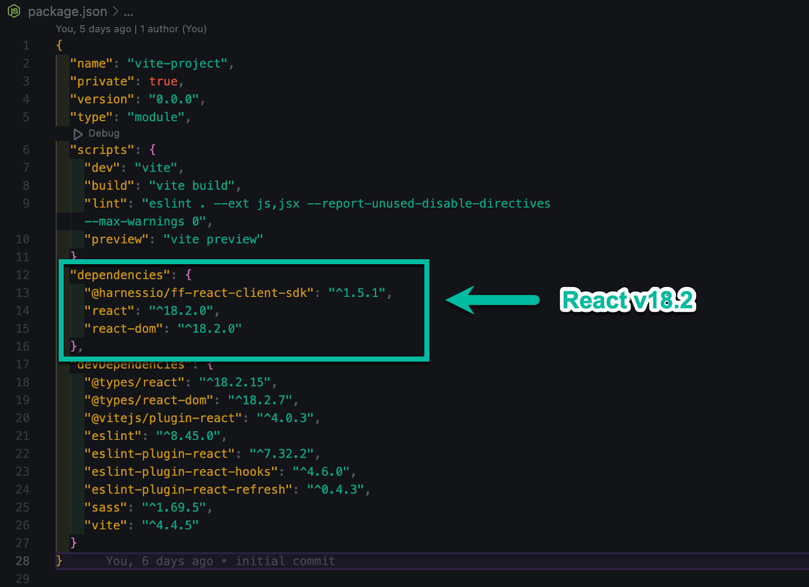
I am using Vite in order to set up my projects in React. You can use Create React App if you choose, but Vite has a lot more features and performance improvements. At the time of this writing, Vite ships with React v18.2.
Installing the SDK
We are going to use npm in this example but I am also providing the install command if you are using yarn as well.
To install the React SDK with npm, type the following command in your terminal of choice:
npm install @harnessio/ff-react-client-sdk
If you are using Yarn, you can run the following:
yarn add @harnessio/ff-react-client-sdk
Once installed you should see the package added to your package.json file. Run `npm install` to install all your dependencies and generate your node_modules folder.
SDK Implementation
We are going to directly modify two files in this example. The first file being the `App.jsx` where all our components are going to be imported. The second file is going to be the component file itself, `Logo.jsx`.
Inside our `App.jsx` file we are going to import our Logo component, PrimaryNav component, Scss file, and the FFContextProvider from the react-client package.
import { FFContextProvider } from '@harnessio/ff-react-client-sdk'; import Logo from './components/Logo/Logo'; import PrimaryNav from './components/PrimaryNav/PrimaryNav'; import './index.scss';
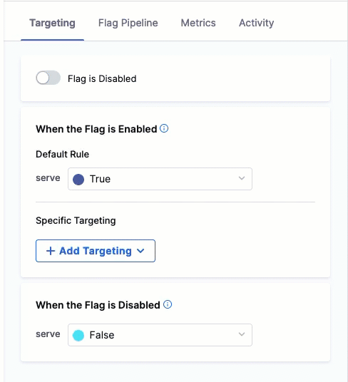
The `FFContextProvider` brings in props like `apiKey`, `target`, etc.
Once we import all our components we are going to build out our App component. The App component gets pulled into the `main.jsx` file as you can see below:
import React from 'react'; import ReactDOM from 'react-dom/client'; import App from './App.jsx';
ReactDOM.createRoot(document.getElementById('root')).render( );
We are creating a component called App and returning all the necessary markup that we need to render our UI.
const App = () => { return (
Getting Started with the Harness React SDK
export default App;
We wrap the whole thing in our `FFContextProvider` so the block in-between can communicate with the SDK. Since the API key is client side, it is ok to have that be visible. Anyone that can open up the console in the browser can see it.
Reactifying the Logo Component
The only thing we are going to import in our Logo component is the `useFeatureFlag` hook from the SDK.
If everything in your Harness UI is set up for your feature flag, the ID you pass in your `useFeatureFlag` hook should match what it says in the Harness UI.

After we import `useFeatureFlag` we create a component called `Logo`. Within that component we declare a `const isEnabled` and set that to `useFeatureFlag('awesomelogoheadergradient')`.
We create an `if` statement that will handle whether or not our feature is on or off. We pass in `isEnabled` and if that is true, we show the `h1` with the classes `logo-title` and `gradient` to display our awesome, new gradient. If our feature flag is disabled in the Harness UI, the user will see the default `h1`.
Then we export our `Logo` component to use inside `App.jsx`. That is it! You have successfully implemented the React SDK into your application with a core UI component. I hope you found this article helpful to get you up and running with feature flags and the React SDK.
import { useFeatureFlag } from "@harnessio/ff-react-client-sdk";
const Logo = () => {
const isEnabled = useFeatureFlag('awesomelogoheadergradient');
if (isEnabled) { return (
YourLogo
); }return
YourLogo
};
export default Logo;
 Check out the original blog here!